I love movie posters. They’re art… we’ll most of them anyway. A lot of movie posters nowadays just picture a couple floating heads and names of the biggest stars strewn across the top in Arial Black font.
After looking at the posters for Buried, I’m glad someone out there is still thinking of movie posters as a way to convey feelings about the movie itself. These three posters are some of my favorite movie posters in recent memory. Especially the poster inspired by Vertigo‘s movie poster.
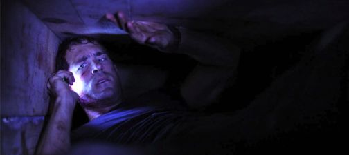
Poster #1

This poster is the closest you get to the standard movie poster with the star featured. Although, still we’re left with a blurry image of Reynolds conveying the fear and anxiety of what it must be like to be trapped in a coffin six-feet under.
Poster #2
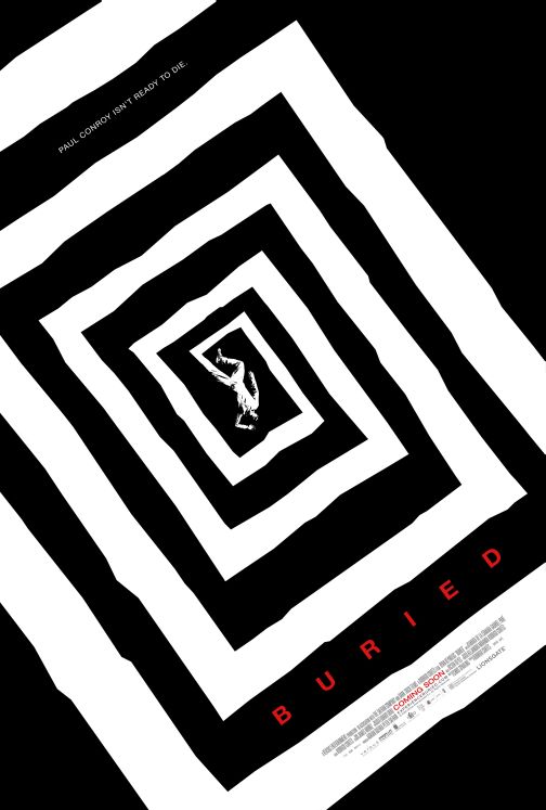
Now here’s a great movie poster. Taking a cue from the famous orange and white Vertigo poster, this one says so much about the movie without saying hardly anything at all. You look at this poster and you can instantly feel how lonely and disorienting it would be to be trapped in a small box underground. This is one I wouldn’t mind hanging on my wall.
Poster #3

Ah, negative space has never said so much. What a perfect example of how to use a gigantic movie poster for something other than featuring big Hollywood stars. When I saw this poster hanging in a coming soon box and my local cineplex, I just stood and stared. Not only does it perfectly capture the feeling of the movie, but it’s so original and unique that you can’t help but stare at it.
Poster #4

One thing that drives me crazy about movie posters and even some DVD and Blu-ray cases is the quotes from critics and publications given special treatment while the rest of the artwork suffers. Even the creators of this Buried poster were able to take the quotes that so often muddle up a poster and turn them into part of the artwork itself.
Which one is your favorite?